Similar blue tones for outfits.
- Charlotte Broady

- Jun 13, 2020
- 1 min read
Over the last few days I've looked a little bit at contrasting colours and how if they are placed side by side they each resonate off the other and make each other a little brighter, bolder and zingier. If wearing colour like this isn't your thing then perhaps similar tones work better for you. So as blue is apparently the worlds favourite colour, I'm going to look at where tones go hand in hand with each other - monochromatic as they call it. These colours in your wardrobe are sympathetic to each other. Do you have a jacket and a dress which just simply 'go'? It might be that these are a deeper and a paler version of the same tone.
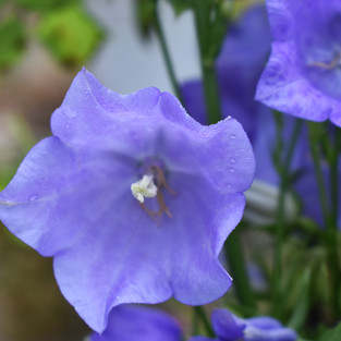
In my wardrobe I try to group colours together, the blues, the lime yellows and the reds for example, depending on how tidy I'm feeling! This means that as I decide what to wear (very easy at the moment - jeans and shirts or jumpers) I can see my choices relatively easily. I see this in nature too. If you look at a flower as it starts to open, bloom and fade, most of the time you are likely to see similar tones, pale at first, deeper as the flower opens and then pale again as it fades away.
So this morning, up with the larks as usual I've taken a few photos of campanula and combined these with other recent images. Here are a few images to inspire you.
Charlotte x


Comments